Why Your Digital Colors Look Wrong — And the RGB Fix That Changes Everything
The Moment You Realize Something's Off
You've spent hours on a piece. The colors look gorgeous on your monitor — rich, vibrant, exactly what you envisioned. Then you send it to a client, or post it online, and suddenly it looks flat. Or worse, it looks like someone cranked the saturation slider up to eleven on their phone. You tweak, you adjust, you second-guess every choice you made.
Here's the thing: this isn't a taste problem. It's a technical one. And once you understand what's actually happening under the hood, the fix is surprisingly straightforward.
Physical Media Brain in a Digital World
A lot of digital artists — especially those who came up painting, drawing, or working in traditional media — carry mental models that made perfect sense with physical pigments but quietly sabotage digital work.
In the physical world, colors mix subtractively. Red and yellow make orange. Layering pigments absorbs light. The more you mix, the darker things get. That's just how paint behaves.
Digital screens work the opposite way. RGB color is additive. Red, green, and blue light combine to create other colors, and at full intensity, they produce white. Nothing absorbs anything. Everything is emitted. When you're choosing colors on a screen, you're not working with pigment — you're essentially programming light.
This distinction sounds academic until you realize it explains why colors that felt balanced in your sketchbook look aggressive on a monitor, or why a soft lavender you mixed digitally prints as something closer to gray.
The Saturation Trap
One of the most common mistakes digital artists make — especially early on — is reaching for full saturation to make colors "pop." It seems logical. Vibrant colors are eye-catching, right?
The problem is that RGB displays can render saturation levels that are physically impossible to reproduce in print, and that are genuinely uncomfortable to look at on screen for any length of time. When you push saturation too high in a digital piece, you're not adding impact — you're adding noise. The eye doesn't know where to look, and the work ends up feeling chaotic rather than powerful.
The artists whose color work consistently lands? They're almost never using colors at maximum saturation. They're using relative contrast — pairing a slightly muted tone with a more saturated one so the saturated color does the heavy lifting without the whole piece screaming.
Try this: pull your saturation back by 15 to 20 percent on your most vibrant colors, then add a small accent in a complementary hue at higher saturation. The piece will feel more cohesive, and that accent will hit harder than if everything were cranked up together.
Monitor Calibration Is Not Optional
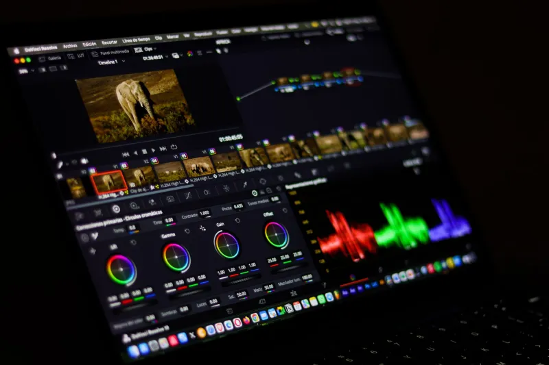
If you're working on an uncalibrated monitor, you are essentially mixing paint in a room with weird lighting and wondering why the colors look different in daylight. It's that fundamental.
Different monitors have different color profiles, brightness defaults, and gamma settings. A display that ships from the factory slightly warm will make you compensate by pushing colors cooler — and then your work looks off on every other screen. A monitor that's too bright will make your shadows look deep and moody on your end, and muddy everywhere else.
Investing in a hardware calibration tool (X-Rite and Datacolor both make solid options in the $100–$200 range) is one of the highest-return purchases a working digital artist can make. If that's not in the budget right now, at minimum, use your software's built-in calibration tool and compare your work on multiple devices before calling anything finished.
Understanding Color Profiles: sRGB Is Your Default Friend
This one trips up a lot of artists who've never had to think about it. When you're working in a wide-gamut color space like Adobe RGB or ProPhoto RGB, your colors have access to a much broader range of hues than most screens can display. That sounds like a good thing — and for print production workflows, it often is.
But for digital display? Most monitors, phones, and web browsers render in sRGB. If you're working in a wider gamut and exporting without converting, what looks incredible in your editing software can shift noticeably when viewed anywhere else.
For work intended to live on screens — social media, online portfolios, client presentations — work in sRGB from the start, or make sure you're converting correctly on export. Photoshop, Procreate, and most professional tools make this straightforward once you know where to look.
Contrast Is Doing More Work Than You Think
Value contrast — the relationship between light and dark areas — is what gives digital art its sense of depth and dimension. Saturation gets a lot of attention, but value is the real workhorse.
A common issue in digital work is that artists add color contrast (using complementary hues) without building enough value contrast. The result is a piece that looks busy up close but reads as flat from a distance or at a small size — exactly the wrong outcome when most people are encountering your work on a phone screen.
A useful habit: convert your work to grayscale periodically while you're building it. If the composition still reads clearly — if there's a clear focal point and a sense of depth — your values are doing their job. If it collapses into a gray blob, you've got work to do before color becomes your priority.
Quick Wins You Can Apply Today
You don't need to overhaul your entire workflow to see immediate improvement. Start here:
- Desaturate your shadows. Real-world shadows aren't just darker versions of the surface color — they shift toward cooler, less saturated tones. Adding this nuance makes lighting feel more believable.
- Use temperature contrast. Pair warm light sources with cool shadows (or vice versa). This single move adds more perceived dimension than almost anything else.
- Check your work at 50% zoom. Colors that look cohesive at full size often reveal balance issues when you step back. Make it a habit.
- Export and view on your phone. Your phone screen is closer to what most of your audience sees than your desktop monitor is. If it looks good there, you're in good shape.
Color theory isn't magic, and it's not a gatekept secret. It's a set of technical and perceptual rules that, once you internalize them in a digital context, make every creative decision more intentional. Your eye didn't fail you — your workflow just needed a tune-up.